11

My name is Kurtis and I'm a designer with Stack Exchange. You may have noticed some updates to the design of your site. The updates are part of a SE network-wide update to a new base css framework. The updates allow us to:

  • Use .svg sprites for retina displays
  • Fix layout bugs
  • More easily add new features to all of our sites in the future

If you see any bugs please let us know.

Thanks!

UPDATES 02/20/2015

Thank you for your feedback. So far we've made a few adjustments based on the comments and answers below:

  • Logo: We've removed the dots in the halos. That seemed to be causing the pixelation people were seeing. The simplification of gradients on the logo was intentional as we're moving to a flatter, simpler aesthetic. This is also a practical decision — It allows us to use .svg's and the file size is smaller without gradients.
  • Header: We've reduced the height of the header. The question list now starts around the same place it does on Stack Overflow.
  • Visited Link Color: We've dulled the color of the visited link to differentiate it more from the unvisited.
11
  • 1
    It looks like the changes you made to the tags may have fixed this issue: CSS z-index causes part of tags to show through notifications on webmasters, web applications, gaming, and gamedev Commented Feb 20, 2015 at 1:49
  • 1
    I came straight here this morning as I knew something looked different. Has the logo changed? looks strange, like its pixelated. I Don't like the new font and also miss the tabbed navigation. AHHH change! :(
    – Max
    Commented Feb 20, 2015 at 2:38
  • The highlights for Blockquotes looks really nice, though it can make quotes from the question and from external resources blend together into a seemingly large yellow block... I've resorted to using Emphasis formatting (i.e., italics) to differentiate quotes from the OP's question versus external sources. But that's just a matter of answering-style, that other users might approach differently.
    – dan Mod
    Commented Feb 20, 2015 at 3:23
  • Another feedback comment (versus a bug): Perhaps the height of the blue strip might be decreased just a little (though it does add to a more responsive-design look), and the Questions | Tags | Users | Badges | Unanswered | Ask Question navigation might be left-justified or emphasized more so the Ask Question link is more visible to new users?
    – dan Mod
    Commented Feb 20, 2015 at 3:44
  • I noticed a few things right off the bat: 1] The site does not fit the screen in my HP Mini- close but no cigar 2] The Search and Questions | Tags | Users | Badges | Unanswered | Ask Question run off the screen on the right a bit 3] The Questions | Tags | Users | Badges | Unanswered | Ask Question has moved to the right causing OMS (over-mouse syndrome) 4] The header is larger 5] Logo is not as crisp. Other than that, who can complain? I am annoyed with the OMS- the rest is fairly minor- not worth complaining. Suggest moving the relevant links closer to the Q&A.
    – closetnoc
    Commented Feb 20, 2015 at 4:54
  • I love whatever font is used when composing questions and answers. It seems much easier to read to me than whatever was in those text boxes previously. Commented Feb 20, 2015 at 13:07
  • @Max could you share a screenshot in an answer with the logo. We did adjust the logo a bit so that we could use an SVG and we changed the font to something a little subtler.
    – Kurtis Beavers Staff
    Commented Feb 20, 2015 at 13:28
  • 1
    This update also fixed the issue with hyperlinked inline code.
    – unor
    Commented Feb 20, 2015 at 15:06
  • I'm wondering if the middle set of navigation links in the header that I and @closetnoc commented on above, and in particular the Ask Question link, will be spotted easily enough by new users? Maybe their font size can be increased?
    – dan Mod
    Commented Feb 21, 2015 at 1:07
  • @KurtisBeavers Links in answers and comments are difficult to recognize on the site (see Max's and my answer below). Can you try to make them more distinguishable from other text? Thanks!
    – dan Mod
    Commented Mar 1, 2015 at 5:08
  • I noticed that the background color for quotes is just terrible. Not a bad color, just too light.
    – closetnoc
    Commented Mar 2, 2015 at 5:35

6 Answers 6

6

As Dan mentioned in the comments, the blue bar at the top is too large now. My biggest problem with it is that it pushes the questions down too far, and I can see two fewer questions than I could before. I used to be able to see six questions on the homepage on my laptop screen, now I can see only four.

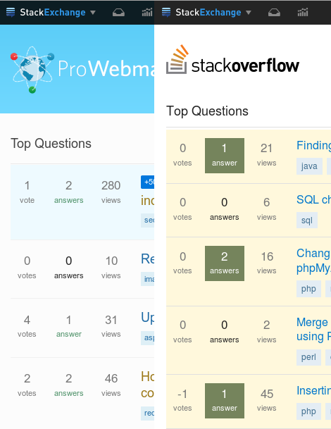
Here is a comparison with StackOverflow where the header takes up significantly less screen real estate:

webmasters header size too large

1
  • As per your update the header is now smaller, on par with StackOverflow. Commented Feb 20, 2015 at 23:08
4

I'm also seeing the pixels in the logo. The white orbits around the globe are quite jagged. Here is how it renders for me:

webmasters logo

I'm using Firefox and it pulls the logo from http://cdn.sstatic.net/webmasters/img/sprites.png

Here is it blown up (in gimp) and you can really see the pixelation:

webmasters logo big

Interestingly the pixelation may be a feature of the image. There are white dots along the orbits. I opened up the SVG sprite in inkscape and noticed I was seeing the pixelation there too because the white dots aren't rendering well at this size. Here are the white dots moved off one of the orbits a little bit to make them more visible:

webmasters logo show white dots

The logo didn't used to look like that at all. It didn't have the white dots around the orbits. The orbits were swooshy and seemed to glow. Here is how it used to be:

old logo

  • The orbits are much simpler now
  • The orbits have dots
  • It has lost the gradients in the colored balls
  • The background is no longer lighter around the globe
  • It doesn't have the light spot on the globe like the sun is shining there
2
  • As per your update, the dots have now been removed and it doesn't look like it has jagged artifacts. Commented Feb 20, 2015 at 23:08
  • 1
    The old logo looked a lot nicer IMO
    – Max
    Commented Mar 2, 2015 at 8:39
4

Okay. Here are my main observations:

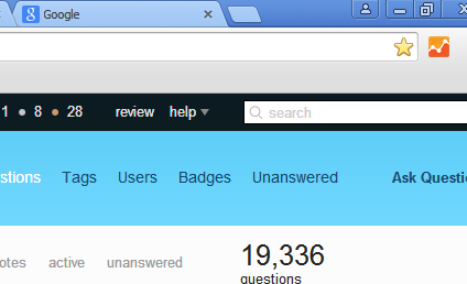
I am sure this does not happen for everyone, however, I have an HP Mini and the screen width is 1024x600 which is not unusual. Here is what is happening.

Being cut-off on right side.

It is being cut-off on the right side.

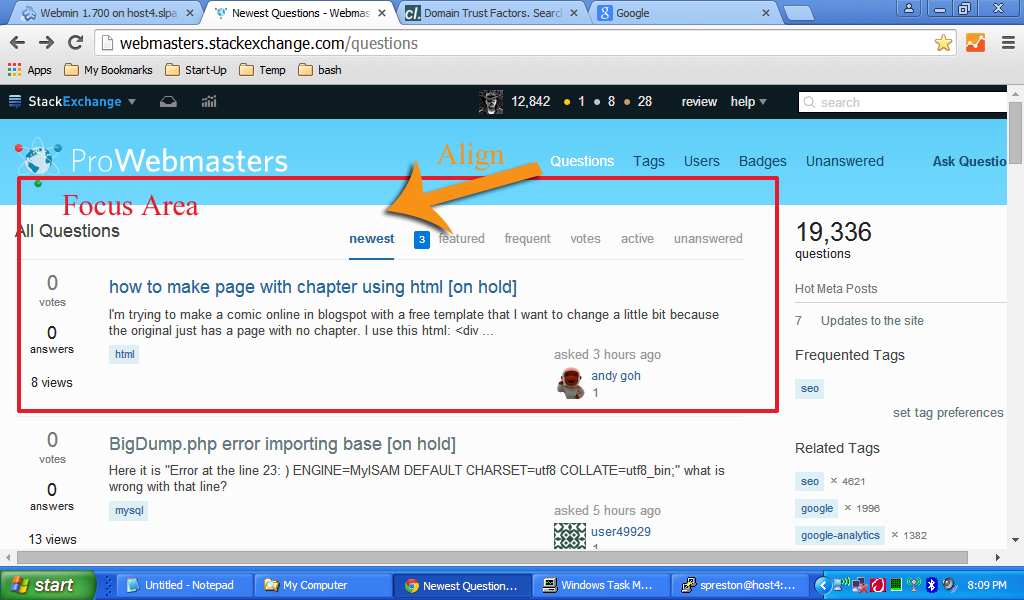
As well, I spoke about OMS (over-mouse syndrome). It seems to me that it would be better from a UX perspective if the Questions | Tags | Users | Badges | Unanswered | Ask Question Links were more in-line with the area of focus and the other related links. Here is an image of what I mean.

Align links.

Also, as Dan says, perhaps we should make the Ask Question link stand out a bit more with a slightly bigger font. Dancing monkeys would not be bad either. Ok. Scratch the monkeys. Kittens!

One more thing while I am thinking of it, perhaps a link to the Help section for asking a question that is obvious marked Question Guidelines. This would help reduce off-topic questions that happens here a lot. Perhaps more than most sites.

We will resume your regularly scheduled program.

3

The new design didn't make this worse, but another long standing CSS tweak that I would love to make to this site would be tweak the visited link color.

I rely on the visited link color to show me if I recently viewed a question or not. On this site, I can barely tell which questions are recently visited and which ones I haven't seen. The difference between the visited links and the non-visited links is a very slightly different blue shade.

I have found a brown color that looks good here: #9C7816 that I would recommend as a visited link color:

.question-hyperlink:visited, .result-link a:visited {color: #9C7816 ! important;}

I use a user script to set this for myself, but it would be nice if it could be a better differentiated color for everyone.

2
  • Stephen, see updates above in the original post. While we didn't go all the way to the brown you suggested (mainly because we're trying to create a standard convention across all of our sites), hopefully the increased contrast will help.
    – Kurtis Beavers Staff
    Commented Feb 20, 2015 at 20:51
  • Thanks! It's not quite as obvious as I'd like it to be, but at least I can see it more easily. Commented Feb 20, 2015 at 23:01
3

Links on the main Pro Webmaster site seem harder to see now because their blue color is less bright and blends in with black text (as apposed to the brown links here on the Meta site).

Maybe a brighter blue can be used to more closely match the color of links on Stack Overflow's site, which are much more easily spotted.

0
2

Hyperlink colour is difficult to distinguish form the actual body content, I think some people may miss when just phrases are hyperlinked (rather that the URL posted). Looks too sublte.

enter image description here

3
  • See my answer above :-) Same thing for links within comments. I'm really having a tough time spotting these, so I'm sure others are as well.
    – dan Mod
    Commented Feb 28, 2015 at 0:36
  • whoops! What colour was the highlight before?
    – Max
    Commented Mar 2, 2015 at 8:40
  • I'm not sure, but it was a lot brighter and easier to recognize than now. BTW, I was tempted to click on the up arrow inside your answer above :-)
    – dan Mod
    Commented Mar 2, 2015 at 8:51

You must log in to answer this question.

Not the answer you're looking for? Browse other questions tagged .